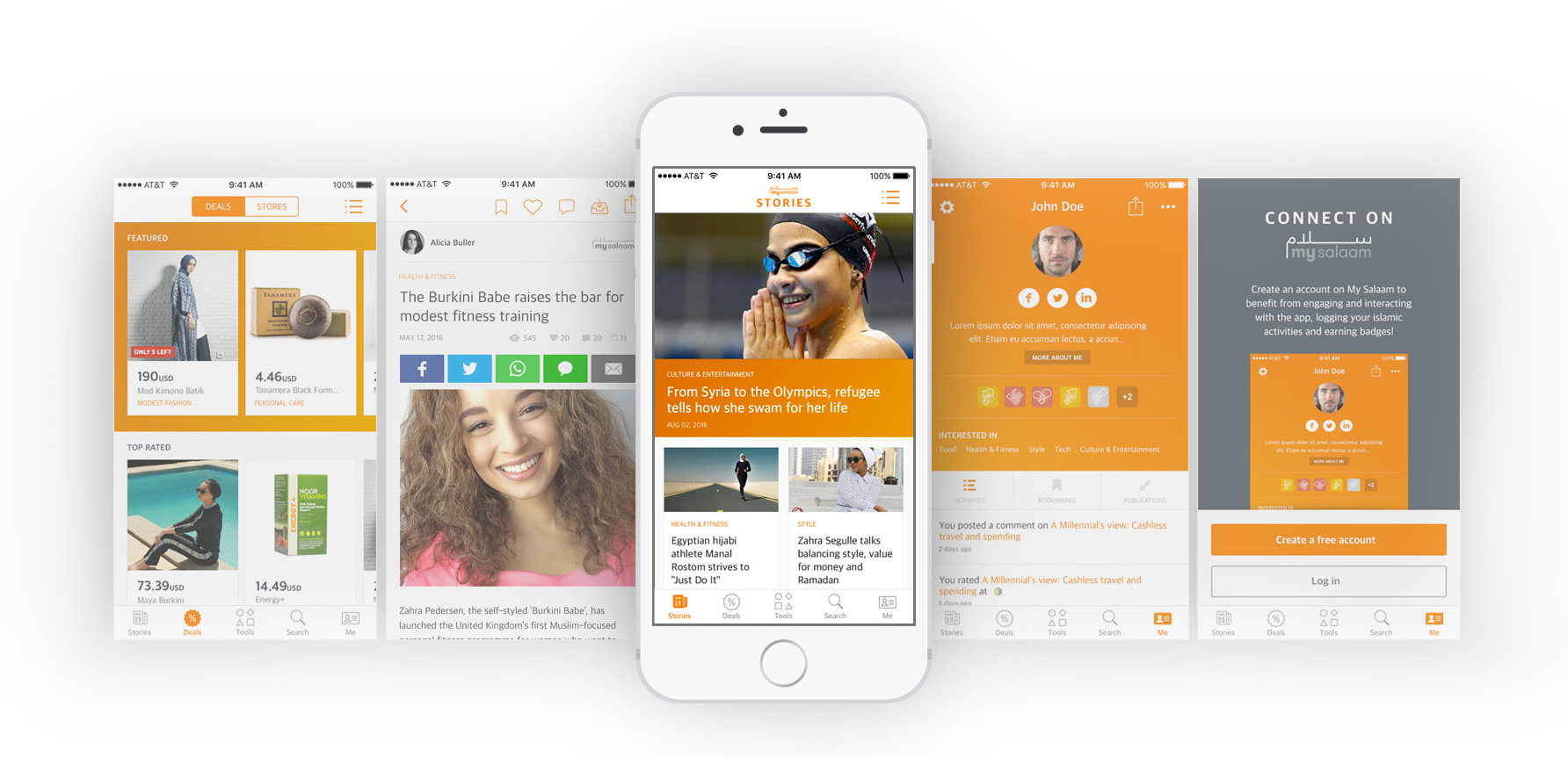
My Salaam is a Muslim focused app, split in 3 main sectors: Stories, featuring top lifestyle articles and media. Deals, showing an extensive marketplace and stores. Tools, offering engaging widgets to help the users in their daily Muslim life.
I was the lead designer for the iOS and Android mobile apps. I worked on the overall re-structure, information architecture, wireframes, UI design and prototype. The main requirement was to follow the human interface guideline for each device.
My Salaam app represents the islamic young generation lifestyle. My biggest challenge was to understand the target audience customs & behavior, and to create 3 totally different sections (news / marketplace / tools) in one app, while having a seamless flow, and an intuitive navigation.
The app was already on the App Store and Android Play store; they were both unusable and very hard to navigate. I did a quick heuristic study to define the main list of points we need to focus on. Information architecture and discoverability were the main priority. The 3 main app sections should be always quickly accessible, and first time users should easily spot the 3 different app areas. I started with sketching the main iOS app structure and flow, to which I ran a remote usability testing to ensure that our goal, having an intuitive navigation, is met. After several iterations, I came up with the below sample, where a bottom nav bar holds the main access points, and each section has its own secondary navigation as a sliding menu:
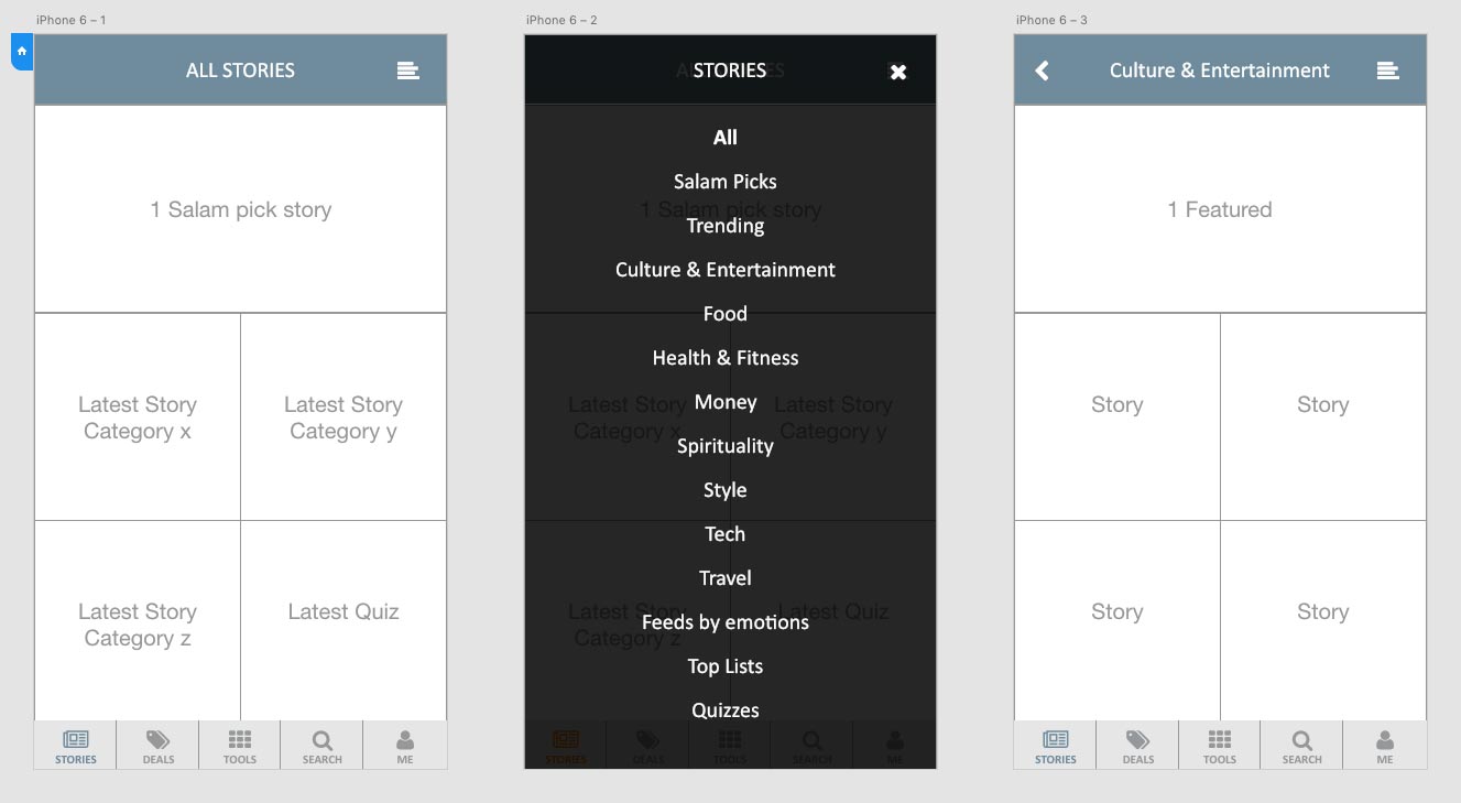
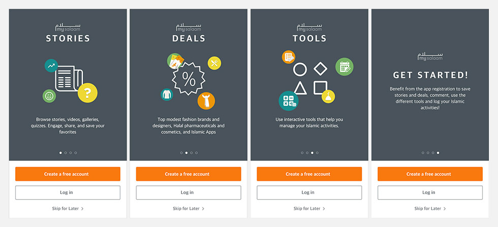
In order to empower the discoverability, I designed the onboarding process for first time users, which focuses on the 3 main areas:
Since the "company" (keeping it anonymous as per the client's request) was adopting an agile process: sprints were scheduled each 2 weeks, where I had to ideate, prioritize features, prototype the soonest for the development team, then work on the UI, and provide them with the assets on Sympli.io. So after tackling the main pain points and sketching the possible solutions, I focused on each section alone, starting with the information architecture (IA), sketching the structure and organizing the content and their features, then moved to designing the UI.
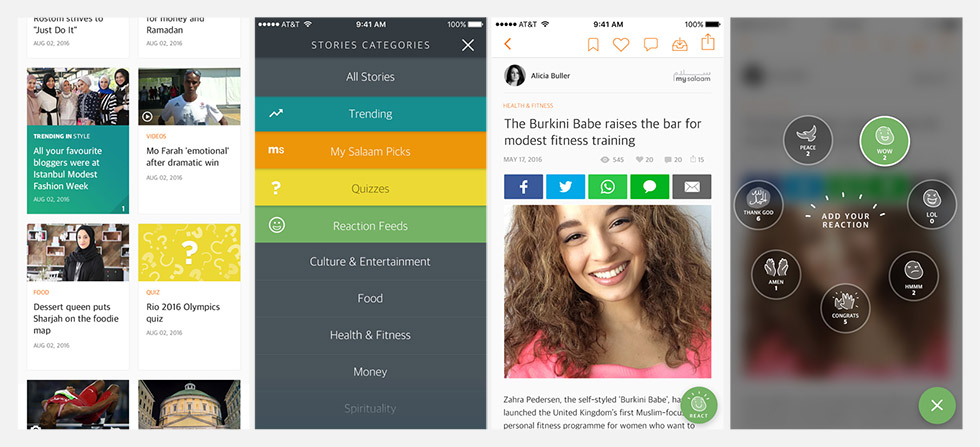
One major business goal was to keep the user engaged as much as possible, increasing the time spent on app metric. For that, in the Stories section, we added reactions for users to express themselves in different ways, created a discussions/comments screen, and empowered the trending & quizzes blocs in the Stories section landing screen, capturing the user's eye to what, according to data, were the users main interest in this section.
In the Deals section, I created a categorized landing screen, a structured way of showcasing the most important products users might be interested in. The Products screen offer a range of similar products at the end of the scroll, keeping the user curious, and creating a seamless flow.
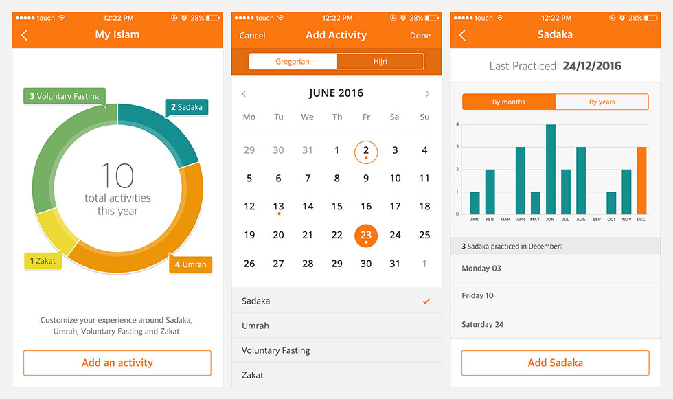
As for the different widgets in the Tools section, I had to understand how, why and when each one is used. I did some online research for similar tools, ran some interviews with a sample of our target audience, in order to approach those widgets with the appropriate solutions.
I was working in parallel on the iOS and Android versions, as both apps were supposed to be built by 2 teams simultaneously. So as soon as the iOS version for each section was approved, I was adapting it to Android Material design, after having created the general structure, and style guide.
Stakeholders and developers needed to visualize the app interactions, so I was creating Invision Prototypes for each section / feature.
Note: The Tools, reactions and badges icons were designed separately by the "client", and are not part of my work.